
Understanding Carrara Marble Vanity Tops: Vein, Tone, and Finish Essentials
Decoding Vein Patterns and Gray-White Undertones in Carrara Marble Vanity Tops
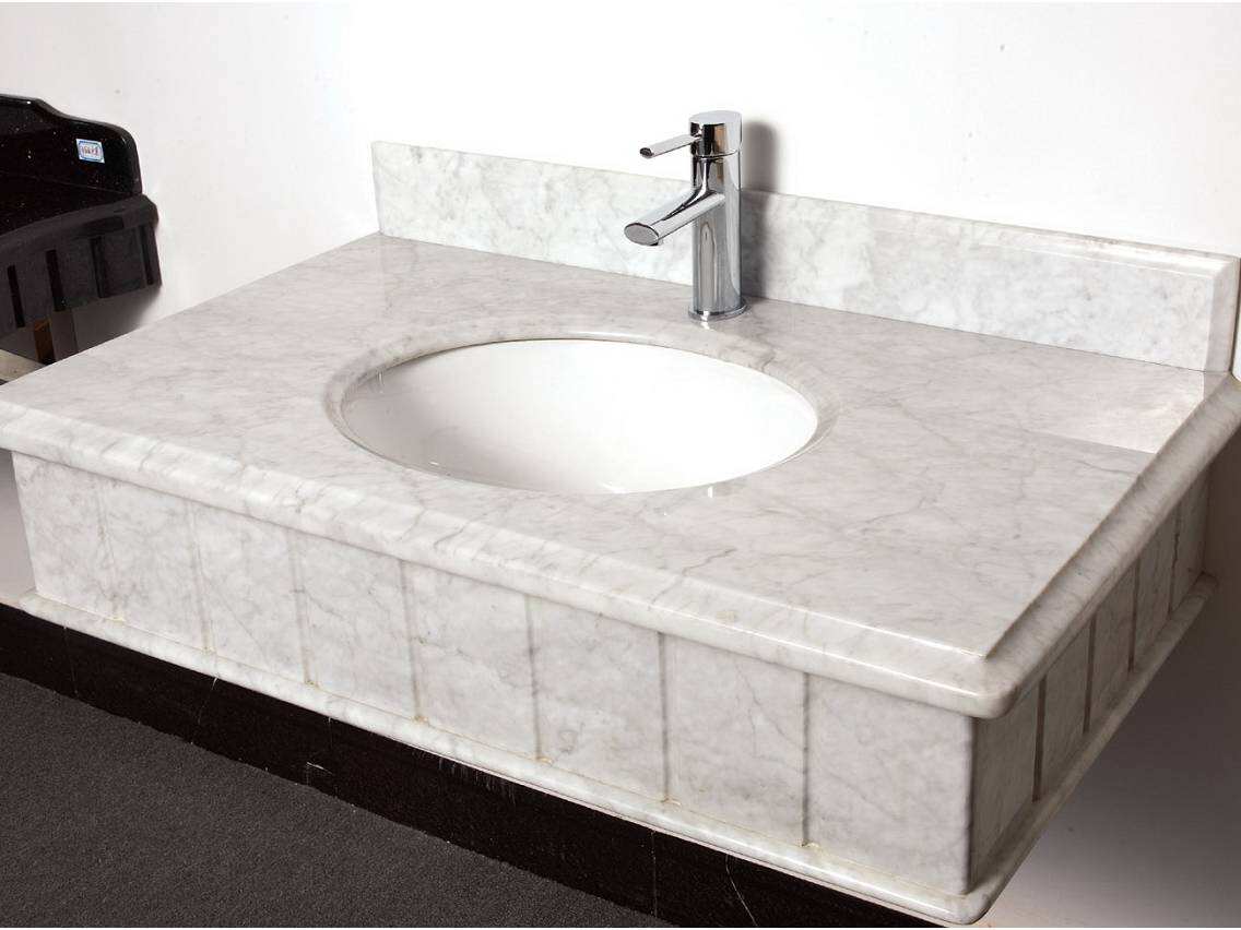
The beauty of Carrara marble vanity tops lies in their soft gray veins that dance across a bright white background. Each slab tells its own story through these natural patterns. Some have fine hair-like lines, others feature strong sweeping marks that create movement across the surface. The color underneath can make all the difference too. Certain pieces have a cooler look with hints of blue-gray running through them, while others glow with a warm taupe undertone. When choosing materials, remember that cool toned marbles work really well with metallic finishes like chrome or brushed nickel hardware. Warmer options tend to complement bronze tones or even rose gold accents beautifully. Always check out samples in actual lighting conditions because different lights bring out various aspects of the stone's character. Look closely at how evenly distributed the veins appear across the entire surface area. A good slab should feel balanced visually without any single vein stealing attention from the whole piece.
Polished, Honed, and Leathered Finishes—How Each Affects Light, Texture, and Fixture Compatibility
The finish you choose fundamentally shapes both performance and presence.
- Polished: Delivers high reflectivity that intensifies veining and amplifies light—ideal for compact or dimly lit bathrooms. Requires diligent sealing (every 6–12 months) to resist water spotting and etching.
- Honed: Offers a smooth, matte surface with subtle texture that conceals everyday wear—including scratches, water marks, and minor etching—making it especially suited for high-use primary bathrooms.
- Leathered: Features a softly textured, tactile surface achieved through controlled abrasion. It diffuses light to deepen tonal richness, hides fingerprints effectively, and adds quiet sophistication without sacrificing durability.
Each finish also informs fixture synergy: polished surfaces mirror metallic finishes with dramatic clarity; honed textures blend seamlessly with brushed or satin metals; leathered tops provide grounded contrast that tempers bolder fixture designs.
Selecting Fixture Finishes That Complement Carrara Marble Vanity Tops
Fixture selection is not decorative—it's compositional. Matching metal tones to Carrara's natural character ensures cohesion, depth, and intentional elegance.
Cool Metals (Chrome, Brushed Nickel): Enhancing Crispness and Modern Cohesion
Chrome and brushed nickel really bring out what makes Carrara marble so special its cool, neutral vibe. The chrome finish has this sharp modern look that catches the eye. Because it's so reflective, it bounces light around those gray veins in the stone, making any space feel brighter than it actually is. Brushed nickel is different though. It's not as flashy but still adds metal to the mix. This finish is more about subtlety, blending into the surroundings without creating harsh reflections. What both finishes have in common is how they let the pure white background of the marble shine through as the main feature. If spaces start feeling too cold or clinical, balance those cool metals with something warm instead. Think about adding some matte black fixtures, maybe some wooden elements, or even throw in some textured linens to soften everything up a bit.
Warm Metals (Champagne Bronze, Rose Gold): Softening Gray Veins for Balanced Warmth
The combination of champagne bronze and rose gold brings a warm touch that softens Carrara marble's cool tones. This helps balance out any harshness while keeping things looking elegant. Champagne bronze has this earthy glow that connects old world techniques with contemporary design aesthetics. Rose gold, on the other hand, offers a delicate contrast next to the clean lines of the stone. These metals don't overpower the subtle beauty of the marble but instead create depth and a sense of calm when installed together. They work particularly well in bathrooms that get little natural light or in rooms where people want to feel cozy but still maintain a touch of class throughout the space.
Choosing Tiles That Elevate—Not Compete With—Carrara Marble Vanity Tops
Monochromatic Pairings: White and Light Gray Tiles That Extend the Carrara Marble Narrative
When it comes to Carrara marble spaces, white and light gray tiles work wonders, especially those big format ones with that subtle sheen. These tiles carry over the look of Carrara throughout both walls and floors without pulling attention away from what matters most. The right tiles will match the basic tones of the stone and follow similar vein patterns, creating that smooth transition between surfaces that makes rooms feel bigger than they actually are. Look for tiles that don't vary too much in color and keep those grout lines really thin, maybe around 1/16 inch or less. This helps maintain that elegant simplicity we associate with real marble. Going monochrome like this ensures the bathroom vanity stays center stage, while everything else just supports that peaceful, put together vibe we all want in our bathrooms these days.
Strategic Contrast: Textured Cement, Herringbone, or Soft-Color Accent Tiles
When it comes to design, subtle contrasts actually make spaces feel deeper without causing any competition between elements. Matte finish cement tiles bring a certain earthy texture and those nice tonal variations we all love. Then there's the herringbone layout which adds this rhythmical movement that works really well alongside Carrara marble's natural flow patterns. The two just seem to get along together instead of fighting for attention. For adding some warmth to balance out cooler tones, soft accents work wonders. Think sage green, oatmeal shades, maybe even a dusty pinkish hue. These colors create nice contrast especially when they're placed strategically in areas like a small shower niche, around the edges of flooring, or along a wainscot panel. And remember, it's best to stick with one main area where these patterned or colored elements appear. This helps maintain good visual balance throughout the space rather than having too many different things going on at once which can confuse the eye.
Creating Unified Vanity-Centric Design: Backsplashes, Cabinets, and Sink Integration
When designing with Carrara marble, think beyond just countertops. The material works wonders when extended vertically throughout the vanity area, creating a cohesive look that ties everything together. Going for a full slab backsplash from the same batch maintains those beautiful tones and textures while also giving better protection against water damage. Want some interesting contrast? Matte zellige tiles or textured ceramics in gentle gray shades work great alongside marble. They highlight the natural veining without trying to copy it exactly. Focus on similar light reflectance values and matching grain sizes rather than pixel-perfect duplication for a more harmonious effect overall.
Cabinet Integration for Balanced Proportions
The right cabinetry needs to work with marble, not fight against it. Grays that lean cool or whites that feel fresh keep spaces feeling open and bright. For those wanting something different, walnut stained wood brings in earthy warmth and adds dimension without getting in the way of those beautiful marble veins. Floating vanities make bathrooms feel bigger and lighter, which explains why they show up in almost two thirds of high end bathroom makeovers according to the latest NKBA trends report for 2024. Hidden hinges and hardware that blends into walls or cabinets help keep things looking clean and uncluttered so everyone notices the stone first, not all the little details in the construction.
When it comes to sink installation, we need to think about how they work as well as look good. Undermount models create smooth surfaces that are easier to clean, which matters a lot when working with something delicate like marble countertops. Solid surface sink and countertop combos eliminate gaps completely, making them ideal for those who want their bathrooms to look super clean and modern. For vessel sinks, getting the right size is important. The best ones tend to be those with gentle curves or oval shapes that match the overall feel of the bathroom space. Big angular basins just don't fit right next to marble surfaces; they end up stealing attention instead of complementing what's already there.
Light reflectance values (LRV) matter in fixture pairings:
Element Ideal LRV Range Effect on Carrara Cabinet Finish 75–85 Prevents "floating top" effect Backsplash Material ¥70 Amplifies natural luminosity Sink Basin 78–90 Reduces shadow contrast
This holistic approach—aligning tile joints with vein direction, avoiding sink cutouts through prominent swirls, and calibrating every reflective surface to the marble's light behavior—transforms the vanity from a functional element into a composed, intentional centerpiece.
FAQ Section
What are the differences between polished, honed, and leathered finishes for Carrara marble vanity tops?
Polished finishes offer high reflectivity, intensifying veins and light, but require regular sealing. Honed finishes provide a smooth, matte surface that conceals daily wear. Leathered finishes are textured and diffuse light, offering a tactile surface that hides fingerprints.
How do I choose the right fixture finishes for Carrara marble?
Cool metals like chrome and brushed nickel enhance the marble's cool tones, while warm metals like champagne bronze and rose gold soften its look. Choose based on the desired ambiance and balance with surrounding elements.
Which tiles work best with Carrara marble vanity tops?
White and light gray tiles complement Carrara marble well, especially when following similar vein patterns. For contrast, consider textured cement tiles, herringbone patterns, or soft-color accents for balance.
Table of Contents
- Understanding Carrara Marble Vanity Tops: Vein, Tone, and Finish Essentials
- Selecting Fixture Finishes That Complement Carrara Marble Vanity Tops
- Choosing Tiles That Elevate—Not Compete With—Carrara Marble Vanity Tops
- Creating Unified Vanity-Centric Design: Backsplashes, Cabinets, and Sink Integration
- FAQ Section