
Selecting the Right Marble Tile for Your Furniture Style
Matching Marble Types to Furniture Materials: Calacatta with Light Wood, Bardiglio with Matte Black Metal
The golden veins running through Calacatta marble work really well alongside lighter woods like oak or ash, which makes it great for those rustic farmhouse looks, Scandinavian vibes, or even transitional spaces that blend old and new elements. The way it contrasts against these woods creates depth without fighting for attention visually. Now when we look at Bardiglio, its dark gray background with clean white lines stands out beautifully against matte black metal frames. This combination fits right in with industrial style rooms or minimalist settings where textures need to be clear and colors don't clash. When choosing materials for floors, going with these kinds of pairings helps the space feel balanced instead of having one element dominate everything else.
How Veining Direction, Color Temperature, and Finish (Honed vs. Polished) Affect Visual Harmony with Furniture
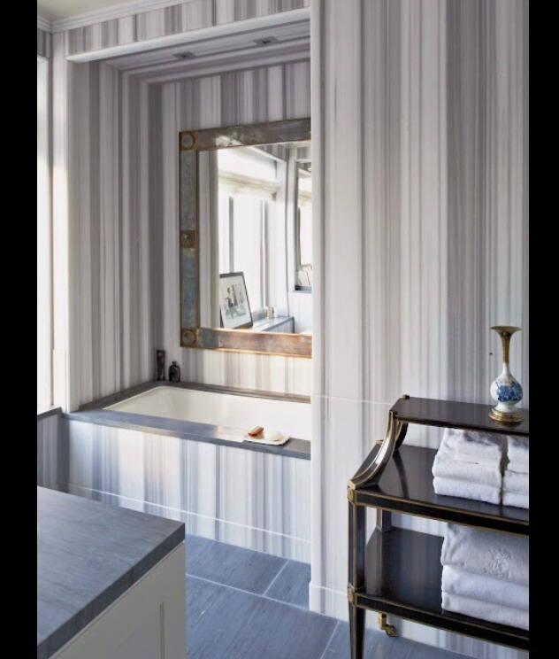
The way veins run in marble really affects how we see space. Vertical patterns in Statuario marble draw the eyes upward, making ceilings look higher when used with those sleek, low sofas. On the flip side, horizontal veining stretches out narrow rooms nicely next to long dining tables. Cool marbles such as Carrara work great against warm walnut furniture because they create that nice contrast people love nowadays. Beige honed marble does something different though it tones down all those shiny metal touches in busy spots where kids run around or guests gather. When polished, marble reflects light beautifully off glass tops and chrome legs, creating seamless transitions between surfaces throughout a room. The honed version has this softer feel that goes well with rougher woods and cuts down on harsh reflections in rooms getting lots of sunlight during the day. All these choices mean marble isn't just for floors anymore it becomes part of the overall design plan from wall to floor.
Color Coordination Strategies Using Marble Tile as a Unifying Element
Neutral Base Anchoring: Leveraging White, Gray, and Beige Marble Tile Tones to Unify Diverse Furniture Palettes
White, gray, and beige marble tiles make great neutral bases that hold together different materials without pushing any particular design direction. Take cool gray marble for example it works really well when paired with warm oak furniture and shiny stainless steel fixtures in those big open living spaces. The lighter colored options actually help brighten up rooms and make them feel bigger than they are. These colors don't have much color personality of their own so they go with almost anything from vibrant fabric sofas to colorful kitchen cabinets or combinations of different metal finishes. Using this approach makes picking out decor less stressful and keeps everything looking connected even as styles change over time.
Accent Integration: Aligning Marble Veining Colors with Furniture Upholstery, Trim, or Metallic Finishes
Marble veins can act like a natural color guide. The golden streaks found in Calacatta marble work really well with brass fixtures or warm amber fabrics. Some Carrara marbles have those cool blue-gray veins that look great next to deep indigo curtain edges or navy leather furniture with matching thread details. Don't go overboard with too many accent colors though – sticking to just one or maybe two extra shades keeps things from getting visually overwhelming. This restraint actually helps avoid that tired decorator look we've all seen too much of lately. Patterned marbles are especially helpful when picking out fabrics because they already contain so much character. These types of marbles make excellent bases for rich, layered interior designs where each element feels intentional yet still lets the stone's natural beauty shine through.
Balancing Texture and Material Contrast Between Marble Tile and Furniture
Wood Furniture: Softening Cool Marble Tile with Warm Walnut or Oak
Wood introduces essential warmth to offset marble's inherent coolness and formality. Walnut or oak—especially in matte or oiled finishes—provides rich amber undertones that temper stark white or light gray marble. To deepen the connection:
- Match visible wood grain rhythm with marble veining direction
- Layer linen or wool textiles to bridge the tactile gap between stone and timber
- Prioritize organic shapes and hand-finished details to reinforce natural material synergy
This interplay transforms potentially austere spaces into welcoming, human-scaled environments—proof that contrast, when calibrated intentionally, becomes harmony.
Metal and Glass Furniture: Enhancing Modernity Through Reflective Polished Marble Tile or Subtle Honed Contrast
Marble tiles with their shiny finish really bring out the best in metal and glass furniture. When placed under chrome legged tables or those sleek glass consoles, they create this gallery effect because the surface reflects so much light. Looking for something understated? Honed marble works great alongside matte black metal frames. It creates harmony in tones while still keeping different textures interesting. Glass tabletops help blend everything together visually, making the natural veins in the marble look like they're part of the whole design scheme. Small metallic details like lighting fixtures, drawer handles, or decorative items serve as links between all these reflective elements without being repetitive. What we get at the end is a modern space that feels clean and self assured, all thanks to smart choices about materials.
FAQ
Q1: What types of marble pair well with light wood?
A1: Calacatta marble, with its golden veins, pairs beautifully with light woods like oak or ash, perfect for creating rustic or Scandinavian style spaces.
Q2: How do horizontal and vertical marble veins affect the perception of a room?
A2: Vertical veins in marble can make ceilings appear higher, whereas horizontal veins can give the effect of widening a room, particularly next to long dining tables.
Q3: What is the advantage of using neutral marble colors?
A3: Neutral marble colors like white, gray, and beige provide a versatile base that can work with various furniture styles, enhancing space and overall harmony.
Q4: How can marble veins be used to guide color choices in decor?
A4: Marble veins, such as the golden streaks in Calacatta, can influence decor choices to create cohesive color schemes with elements like brass fixtures or matching fabrics.